Industry Sponsored Project
Redefining Product Discovery
Mobile UI/UX
UX Team Lead
UX Designer
Client
Timeline
Tools
Team

16 weeks

.png)
.png)
1 Graduate UX Design student, 4 Undergrad UX Design students
.png)
My role
As the senior-most designer, I led the team through feature scoping, brainstorming, user research, wireframing, prototyping, and testing for the redesign of the Amazon Mobile skincare section. I guided the project from initial concept to refined design, ensuring each decision was rooted in user insights and aligned with business goals.
Beyond design leadership, I served as the primary point of contact between the team and stakeholders, facilitating collaboration, gathering feedback, and maintaining design consistency across iterations.
Overview
Although Olay enjoys high brand awareness, its presence on Amazon Mobile underperformed expectations, only 24% of P&G beauty buyers were purchasing Olay products on the platform. Users struggled with scrolling fatigue, cognitive overload, and complex product listings that made it difficult to find suitable skincare items.
This project set out to reimagine the skincare discovery experience for Olay on Amazon Mobile, focusing on simplifying navigation, increasing engagement with the skincare quiz, and integrating personalized recommendations.
The goal was to help users find the right products effortlessly while improving their confidence in making purchase decisions and, ultimately, driving brand engagement and sales.
What was the problem?

.jpeg)
.jpeg)
The existing shopping experience on Amazon Mobile presented users with overwhelming product lists and limited guidance. Many users ignored the skincare quiz banner, mistaking it for an ad, and when they did find it, the results page introduced more confusion than clarity.
Have to type “skin care quiz” in the search bar to find it.
Additionally, the Olay storefront lacked prominence, preventing users from exploring more about the brand or discovering curated product sets. This fragmented experience meant that users were not only losing interest but also missing opportunities for personalized discovery and confident decision-making.
Similarly, the Olay storefront was not the first thing that appeared when searching a product from that brand making it difficult to discover
Our challenge was to simplify the discovery flow, surface personalization more effectively, and create an experience that builds trust and clarity at every step.
How were our users suffering?
Through a series of 12 in-depth user interviews with skincare shoppers aged 20–30, we uncovered recurring frustrations with the Amazon Mobile skincare experience. Users described the process as “overwhelming,” “hard to trust,” and “too much scrolling to find what I need.” Many reported ignoring the skincare quiz altogether, mistaking it for an ad or not understanding its value.
“I didn’t even know there was a skincare quiz in the Amazon app...why is it hidden like that?”
“I care about what goes on my skin, but finding ingredient details takes forever.”
“It’s annoying to keep going back and forth between products. I just want to compare them side by side in one place.”
To broaden our perspective, we analyzed online storefronts like Sephora and Ulta and visited offline beauty counters at Target and CVS. Both showcased how thoughtful product placement, guided discovery, and clear categorization helped customers find what they needed effortlessly.
In contrast, Amazon users felt lost and overwhelmed, scrolling through dense listings without structure or guidance. These comparisons revealed the opportunity to bring that same clarity and ease of navigation from curated beauty experiences into Olay’s Amazon Mobile redesign.
Brand wise search feature

Products were suggested based on users skin preferences

Users could set their skin preferences

Users could find popular products in the search page itself
Amazon’s skincare section already offered a vast range of products, detailed reviews, and powerful search capabilities features that made it convenient for users who knew exactly what they were looking for. The platform excelled at variety and accessibility.
But for users seeking guidance and discovery, the experience felt impersonal and fragmented. The context focused on how users, especially those new to skincare, struggled to find direction or understand where to begin.
Hidden Guidance Tools
The skincare quiz, designed by Amazon to personalize recommendations, was difficult to locate and often mistaken for an ad. Users missed this key entry point entirely, defaulting to manual searches that felt aimless and exhausting.
Disconnected Brand Journeys
Even when users wanted to explore a specific brand like Olay, brand storefronts were buried several layers deep in the interface. This made it hard to view complete product ranges or understand how items related within a skincare routine.
The absence of clear, guided exploration left users overwhelmed and disengaged. For P&G, this meant fewer opportunities for brand discovery, reduced visibility for Olay’s products, and a missed chance to convert browsing into meaningful, personalized shopping experiences.
Aligning user needs with business goals
While user research focused on usability and satisfaction, the business objectives centered on increasing engagement and conversion. The redesign aimed to enhance Olay’s discoverability, encourage trade-up purchases by showcasing premium lines, and build long-term loyalty through better storefront visibility.
Our Strategy:
Reduce user effort and emphasize on personalization, therefore simultaneously improve user satisfaction and increase the likelihood of purchase and brand retention.
Brainstorming, early sketches & testing
During the brainstorming phase, we created quick hand-drawn sketches to explore ideas for quiz placement, brand visibility, and comparison flows. This allowed us to think freely, test multiple layouts, and align as a team before moving into structured wireframes.
These sessions led us to concepts we eventually refined and prepared for user testing feedback.
.png)
.png)
.png)
%20(1).jpeg)
Design solution
Our approach was informed by competitive benchmarking with Sephora and Ulta, where personalization and discoverability were key differentiators. We wanted to translate those principles into the Amazon Mobile context without disrupting its native shopping environment.
Two distinct user flows were designed:
Generic product searches
Targeting users who didn’t have a specific brand in mind.
EXAMPLE: "Cleanser"
Search Page
-
When users searched for general skincare products such as “cleanser,” a “Skincare Quiz by Brands” banner appeared within the search field.
.png)
-
On the product results page, a floating skincare quiz banner remained visible as users scrolled, ensuring the feature stayed discoverable.
-
A “Shop by Brand” section appeared at the top of the results, allowing users to easily navigate to brand-specific product listings.
.png)
This flow catered to users uncertain about what to buy, guiding them toward relevant brands and personalized recommendations instead of leaving them overwhelmed by unfiltered product lists.
Brand-specific searches
Aimed at users who already knew which brand they wanted to explore.
EXAMPLE: "Olay cleanser"
Search Results Page
.png)
-
For brand searches such as “Olay cleanser,” the search interface displayed a brand-specific quiz banner and Brands Amazon storefront banner featuring that brand’s products.
-
A brand Amazon storefront banner featuring that brand’s products allowing users to visit the brand’s dedicated page directly from the search experience.
.png)
-
On the product results page, a floating brand-specific quiz banner stayed visible while scrolling.
-
A brand storefront section encouraged users to follow the brand, explore curated collections, and access exclusive offers or deals.
This flow improved visibility for Olay and other P&G brands, helping users explore full product ranges while fostering brand engagement and loyalty within Amazon’s ecosystem.
Quiz Results Page
.png)
.png)
-
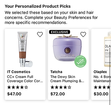
Products Tab: Displayed personalized product recommendations why the product was selected for them with a compare widget that allowed users to evaluate multiple items side by side.
-
Regimen Tab: A new feature not previously available on the Amazon app, this section guided users through a step-by-step skincare routine, explaining when and how to use each product. It also included an “Add to Cart” option to simplify purchasing the complete routine.
.png)
The new Regimen feature addressed a critical gap in the existing experience. By providing contextual guidance, it helped build trust with new users who might otherwise feel overwhelmed by the vast product catalog. This structure turned the experience from transactional to educational, offering reassurance, clarity, and a sense of expert-backed personalization.
Compare Products Page

-
Within the comparison view, the first selected product stayed static for easy reference while users scrolled, added or removed other items to compare.
-
Users could add or remove products from their regimen directly within this interface.
Users expressed frustration about switching between tabs to compare similar items. This feature minimized cognitive load, reduced friction, and supported more confident, informed purchasing decisions.
Impact and Outcomes
What did our users say
1.
More Intuitive and Guided Experience
Users found the redesigned flow easier to navigate, describing it as “less cluttered” and “more like having a consultant inside the app.”
2.
More Intuitive and Guided Experience
Users found the redesigned flow easier to navigate, describing it as “less cluttered” and “more like having a consultant inside the app.”
3.
More Intuitive and Guided Experience
Users found the redesigned flow easier to navigate, describing it as “less cluttered” and “more like having a consultant inside the app.”

What did our stakeholders say
Stakeholders at P&G and Amazon appreciated how the redesign aligned with both user needs and business goals. The team recognized the potential for these improvements to increase engagement and encourage brand loyalty through smoother, brand-driven discovery.
They valued the evidence-based approach, where each feature such as improved quiz visibility and brand storefront integration was directly tied to a validated user insight.
Feedback emphasized that the project offered a scalable framework for other beauty and personal care brands under P&G’s portfolio, showcasing how strategic UX interventions could drive measurable business outcomes.
Real world implementation
One of the most rewarding outcomes was seeing two of our proposed improvements deployed on the live Amazon app.
These changes demonstrated that our design suggestions had a tangible impact beyond the concept phase, influencing how millions of users now interact with beauty products on Amazon Mobile.

Search Page
Brand storefront banners on both the search and search results pages
